


12
2013
Designers Think Apple’s New Flat iOS Look Is ‘Ugly’ and ‘Harsh’ and Blinding
 Article submitted by ThaBloggers
 Comments Off on Designers Think Apple’s New Flat iOS Look Is ‘Ugly’ and ‘Harsh’ and Blinding
 Designers Think Apple’s New Flat iOS Look Is ‘Ugly’ and ‘Harsh’ and Blinding
After years of complaints about Apple’s cheesy, outdated, and decidedly “skeuomorphic” iPhone software look, the company and its geek design god Johnny Ive have unveiled iOS 7 and, well, nobody in the design-geek set really likes it. Well, not nobody: The Wall Street Journal, that arbiter of cool, called it “cool.” And the Apple-obsessed blogger John Gruber wrote a whole post praising Ive’s new vision for the iPhone. But even he admits “iOS 7 is not perfect,” justifying his conclusion because “this new design framework will evolve and improve over time.” Not everyone was so forgiving. Here’s why not.
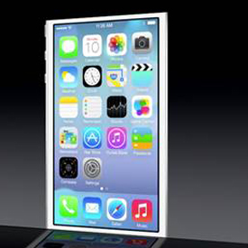
Yes, Apple’s icons have a “flatter” look, as promised. Some would even say the phone has “depth.” But it’s almost as if Apple got the memo about ditching skeuomorphism — many a joke was made during Monday’s Worldwide Developers Conference keynote about faux leader and felt — but didn’t pay any attention to the other grips. “Inconsistent” is a word that comes up a lot in the early discussions of the new software. “I was surprised when the screenshots started showing up. Inconsistent look and feel. Harsh colors. No harmony. No core theme,” writes The Verge’s Joshua Topolsky in a scathing review. To give one example, Ryan Katkov, a designer for Life 360, points us to the new icons for Safari and Mail. “Safari’s icon — what were they thinking? The gradient goes from light to dark. Contrast that to Mail’s icon, which goes from dark to light, and also sits on a filled background. Why?”
The entire article can be found here:
http://news.yahoo.com/designers-think-apples-flat-ios-look-ugly-harsh-145334967.html
——
In Response: I personally think the new layout from the pictures looks extremely sophisticated. In fact, the icons appear rather crisp and professional something a person would expect from Apple. However, I am kind of surprised that these “geek” designers don’t like it. They usually seem to like everything Apple throws out no matter how redundant it is! My personal beef with Apple has always been their prices and minor upgrades to their phones. Anyway, you think those designer critics prefer Samsung over Apple? Just a thought!


